
Ask the agent for a time-location chart, watch it work, then open the result beside the schedule. Recorded in Planlab with a fictional viaduct programme.
We gave an AI agent one sentence and a 361-activity viaduct programme. In under three minutes there was a time-location chart on screen: 284 of the 361 activities across twenty location bands: eighteen for the deck spans, plus one for each carriageway. The activities were coloured by work type. Nobody typed a position. This post is about how the agent found the positions, what it refused to guess, and why the chart it produced still matches the programme after you change a duration in the activity table.
If you plan linear works (roads, rail, tunnels, pipelines, viaducts) you already know the time-location chart is the right picture. Also called a time-chainage chart, a linear schedule or a line-of-balance diagram, it plots time on one axis and position along the works on the other, so every moving activity is a sloped bar whose angle shows its rate of progress, making potential collisions between crews easier to identify. The expense sits in the position data. Someone has to tell the chart where along the works each activity physically sits, and the CPM tools we have worked with do not record it. That is the job the agent did here, which is why the rest of this post is about the agent rather than about the picture.
One sentence produced a time-location chart from a 361-activity P6 programme
The test schedule is a viaduct refurbishment programme: 361 activities, two carriageways with ten piers each, eighteen deck spans, and the repeating cycle of scaffolding, concrete repair, corrosion protection and jacking that anyone who has planned structures work will recognise. In Planlab the schedule and the time-location chart are in the same application, with an AI agent sitting next to both, so there was nothing to prepare beforehand. The prompt was one sentence. Make a TLChart from the Viaduct schedule.
The agent worked for under three minutes. It read the programme, went looking for wherever the physical position of the work was recorded, found chainages in the activity data, and derived twenty location bands from them. It grouped the work by type to get the colours. Then it came back with a chart to look at rather than a chart it had already saved: 284 activities across twenty location bands, both carriageways, and one click to open it full width.
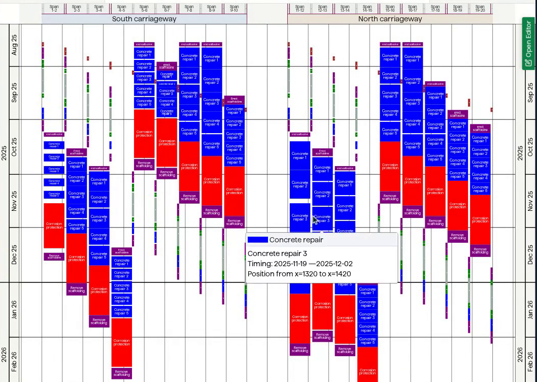
The chart the agent built, on its own. Months down the sides, spans across the top, one bar per activity. Recorded in Planlab with a fictional viaduct programme.
Why P6 cannot draw a time-location chart
To see why a few minutes of agent time is worth writing about, it helps to know what those minutes replaced.
A Gantt chart asks nothing of you that the schedule does not already hold. A time-location chart needs one thing more, and it is the one thing the CPM tools leave out: where along the works each activity physically sits. Chainage, station, span, zone, pick your vocabulary. Primavera P6 has no native field for it, which is why the teams that need it improvise with user-defined fields or activity codes.
So the specialist tools ask you to supply the missing location mapping. You export the schedule or connect to its database, then tell the chart where the activities sit along the works. In TILOS, for example, start and end chainage can travel through P6 user-defined fields or be derived from a sector assignment (a named stretch of the route with preset start and end coordinates). An optional UDF or activity code can associate an activity with the TILOS template that controls its appearance.
The direct-field route can still mean entering two location values and a template reference across hundreds of activities. On this programme, applying all three to 284 charted activities would mean 852 field entries. Sector mappings and defaults can reduce that work, but somebody still has to translate the planner's location logic into the specialist tool.
The agent read that work out of the programme instead of asking for it. The positions were already there, in the shorthand the planner wrote when they built the programme, which a human reader understands and an import wizard does not. What the agent removed was the transcription of that thinking into a form some other tool would accept, not the thinking itself.
Every position on the chart traces back to the programme
The split between what the agent derives and what CPM supplies has to remain traceable. A bar's dates come straight from CPM. The agent derives the missing position data: each activity's physical location.
Because that location is a claim about the physical works, the agent has to say where it came from: if it parsed chainages out of activity names or codes, it shows you the mapping it used, and you can read it the way you would read a graduate's working. Where the programme records the geometry nowhere at all, the right answer is that you do not yet have a time-location chart, and it says so. Spacing the activities evenly along an invented axis would look authoritative and be fiction.
Change a duration and the time-location chart moves with it
A chart that lives in its own file cannot follow a schedule change, however it was drawn.
The specialist time-location tools are, by design, not schedulers. None of the ones we have used runs CPM, and none of them pretends to: your scheduling tool stays the source of truth, and the chart is a view onto a copy of it. That is a defensible engineering decision, and it is a large part of why they interoperate with everything as well as they do. That separation creates a recurring workflow. The programme gets updated with actuals, the dates move, and the chart is still drawn from the old dates. Someone re-exports, re-imports, checks that the location and style fields survived the trip, and re-issues the picture.
If the update itself is the part that hurts, see our post on automatic progress updates. In a claim week, or the day after a sequence change everyone is arguing about, that is the task that gets dropped, and the chart on the wall ends up a revision or two behind the programme it claims to describe, with no way for the people reading it to tell.
The agent built this chart inside the schedule rather than from an export of it, so there is nothing to re-issue. Put the activity table back beside the chart. Find A3410, "Erect scaffolding" on span S11-12, sitting at three days. Change it to thirty. Nothing is exported, nothing is imported, and the agent is not asked anything at all. The bars glide to their new geometry, the work downstream of that span shifts with them, and the chart's own tooltip then reads 2025-10-08 to 2025-11-18, which is exactly what the grid row beside it says.
Change a duration in the schedule and the chart updates with it; no export or new agent prompt required. Recorded in Planlab with a fictional viaduct programme; the four-second reschedule is shown at 5× speed.
Editing from the chart works too. For a temporary study, corrected locations can stay inside that chart. If they should travel with the programme, the chart can write each activity's physical start and end locations back as user-defined fields. Those edits use the same pipeline as every other schedule change, so they travel with the XER.
Either way, the agent's first chart is a draft you can correct by dragging the bars, not a picture you have to re-prompt.
The agent does not invent geometry that is not in the programme
It cannot invent the geometry. If nothing in the programme records where the work happens, no model will conjure it. You tell it once, in a sentence, and it uses your numbers from then on. That is a better deal than filling in several hundred cells, and it is still a sentence you have to be able to write.
A few minutes is not a keystroke. A first draft of a chart that would otherwise be an afternoon is a good trade, and it is still a live agent run rather than a deterministic function. Across the runs we recorded for this post the first turn took anywhere from under three minutes to about six, so the run in the opening is the quickest rather than the average. One run produced nothing we would have shipped. You review what comes back before you use it.
The specialist packages do things this does not. Mass haul, cut and fill profiles under the same distance axis, elevation and slope diagrams generated from survey data, an annotated site plan behind the bars. If you are planning bulk earthworks and the mass-haul diagram is the deliverable, those tools remain the tools that draw it.
Three questions to ask about any time-location chart
The general lesson is not about our product, and not really about AI either. Whoever or whatever produces the picture, these are the questions that matter:
- Where does the position data come from, and how much of it do we type? Find out whether positions must be entered on each activity or whether the tool derives them from fields, codes or naming already in the schedule, and what happens when new activities are added. If it derives the mapping, ask to see what it used.
- What happens on the next schedule update? If the answer involves an export, that is the frequency at which your chart is actually correct.
- Can we edit from the chart, and where does that edit land? A chart you can only read is a report. A chart you can edit through is a planning surface.
We wrote a fuller version of that exercise in our scorecard for evaluating AI scheduling software, which is worth a read if you are running a comparison rather than satisfying a curiosity. The same instinct drives why most project reports are written backwards: let the agent do the assembly, and keep the judgment with the planner.
Planning linear works?
If your time-location chart is a document somebody re-issues after every update, that is the work this is meant to remove. Get in touch and we will show you the same run against a programme of your own.